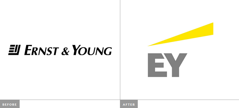
There has been a great deal of laughter and head shaking going on as a result of Ernst & Young’s recent rebranding. We concur, it is somewhat of a spectacular fail, for a number of reasons which I will go into shortly.
Along with the new CEO Mark Weinberger, they’ve taken the opportunity to simplify their name and redesign their logo. As Mark explains:
“From 1 July we will be called EY. Shortening our name will provide consistency and ease of use for EY practices and clients around the world. We have also redesigned our logo, reflecting our new brand name clearly in the design. Our new brand name and logo demonstrate clearly and boldly who we are and reflect the goal we have recently set ourselves to be the number one brand in our profession.”
Right, we cannot see how this makes any sense! It sounds like corporate gobbledygook.
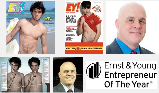
Here’s where the fail begins. A quick Google Image search of “EY” will result in a an endless stream of near naked young men in homoerotic poses. It seems that there has been no research into the new name that they now share with EY! Megateen a Spanish soft porn mag. For a firm that is supposed to be a consulting powerhouse, this lack of research is an especially big cock-up!

We understand that it is definitely easier to say EY, the reality is that it is simply an abbreviation and could have been solely a verbal nickname (which it may have already been), without needing to be an official renaming.
The new logo itself is bold and simple, but that is it. It is bland, quite static and as a result lacking substance. Although the yellow beam is a device that has been used in the prior marketing material, it does nothing for this brand mark but leave you wondering whether this is a freight company or as someone put it, “the parent company of budget car rental”.
This was an opportunity to create something spectacular and meaningful and in our opinion is a spectacular fail and a lazy creative approach. We expect this to be a brand fail for the ages.
What do you think?


