Our totally unforeseen, but perfectly timed brand change.
How does a simple 3 letter word lead to a rebrand? The little word I am referring to became the instigator of our purpose redefinition (see the full purpose story here). That work led to more!
As a result of our team’s positive workplay with our new purpose, another awesome idea arose. Just like changing our purpose, rebranding was also unforeseen. But it too had perfect timing.
I am ever the encourager of change. More often than not though, I am the instigator! So it’s ironic that I can be resistant to positive change on my own brand. I will expand on that shortly, but it was insightful to feel what our clients do when it comes to significant brand changes.
Time to refresh
I was ready to publish a post announcing our new purpose. Then George, our Creative Director, threw a massive Sponge spanner in the works!
The Sponge brand was designed over 20 years ago. We were a very different, and very naive crew back then. In the decades since, we’ve evolved a lot! And as George rightly suggested, now would be the ideal time to make our brand identity match our message.
We could benefit from a brand refresh to realign to our purpose and culture.
Our process
When working with clients on a rebrand or brand refresh the process is quite involved. It starts with the ElectroMagnetic Brand foundation work. Because good design is table stakes, but meaning is magnetic!
The high level project flow for such a project looks like this (with constant client involvement of course):
 With our project we had the fast track. We evolve our brand foundation regularly, with annual values work. Now, with the new purpose work we’ve done, our culture is stronger than ever. And it was our Creative Director who suggested the work, so he was already cooking up some ideas!
Here’s the word from George
One evening whilst wrapping up on some designs for our brand I found myself thinking. Our brand logo that has stood strong since 2001 no longer really had the right feel with what our brand represents today.
So I felt inspired to look at some directions it could evolve to that better aligns with who we are today.
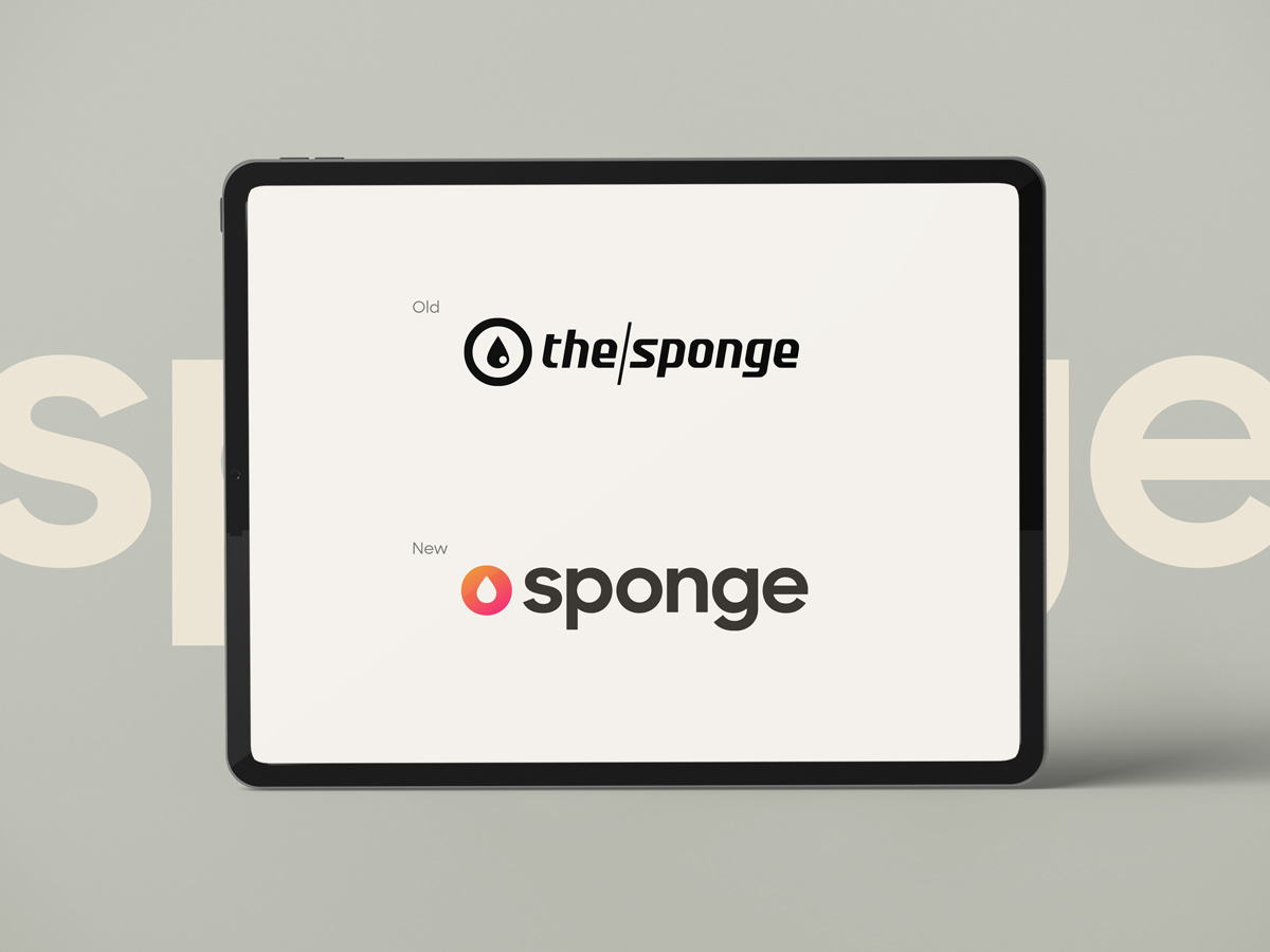
My main focus was to try and further simplify the design but give it some much needed warmth, friendliness and openness. Through my session of playing around I kept feeling that keeping ‘the’ (in The Sponge) just wasn’t working for me, and was losing the beauty and simplicity of its form.
I didn’t like compromising on what I felt was right, so I proposed it was not needed and we could say just as much as we did without it.
The key overall was to make our brand more human, less clinical.
The challenges of change
Updating the brand identity to align with our culture was a no brainer. And with our design team, roll out of the new brand is pretty straight forward too.
The bigger challenge with this work came with the recommendation to drop the “the” from The Sponge. Name changes open a can of worms we are familiar with. Ours is an agency that loves and is renowned for naming!
Apart from my personal attachment to the old name, there were minimal challenges. But before we committed to the name change we had to do some work. In our case it was quite minimal. There were checks to make sure we could register the new name. Some small technical issues arose with ASIC but were easily solved.
Interestingly the domain name sponge.com is available for the small sum of US$100,000. We will happily keep ours as is.
Introducing our new brand
And who better to share the good word on the new design than the creator behind it. Here’s George:
The key area I felt needed the most attention was the typography of the logo, the old typeface had served us well and seemed quite modern and forward for its time. But now, it felt a little too cold and styled to appear modern, rather than truly timeless.
I really wanted to give new typography a more open, rounded feel. Something that feels warmer, friendlier and a little bit playful. By having type that is clean, but not too geometrically precise, helps project the feeling I felt was the right fit.
From there I looked to further simplify our logo icon. To make it as visually simple as it can go without losing what it needs to say. It also went from the old perfect circle shape to a slightly compressed circle, a little fatter in width to play on the idea of being so saturated, or full that you are ready to burst. This also helped it marry to the proportion of the typeface better as well.
And finally some colour exploration. I wanted to make sure it showed warmth, life and depth. Through my trials of different flat colours I still felt I wasn’t getting the feel I was after. It was missing the depth and energy I want it to have. So I experimented with some gradients and immediately I liked how that livened the icon.
The warm feel is much more alive and radiant. Using nice sunset-like hues really adds emotion to it. I then coupled that with a new less harsh black tone for the typography. The stark black we had in our old logo although bold was too cold and contrasty for the new icon. It has now become more of a dark charcoal tone, which helped balance the contrast of the icon and type a little better.
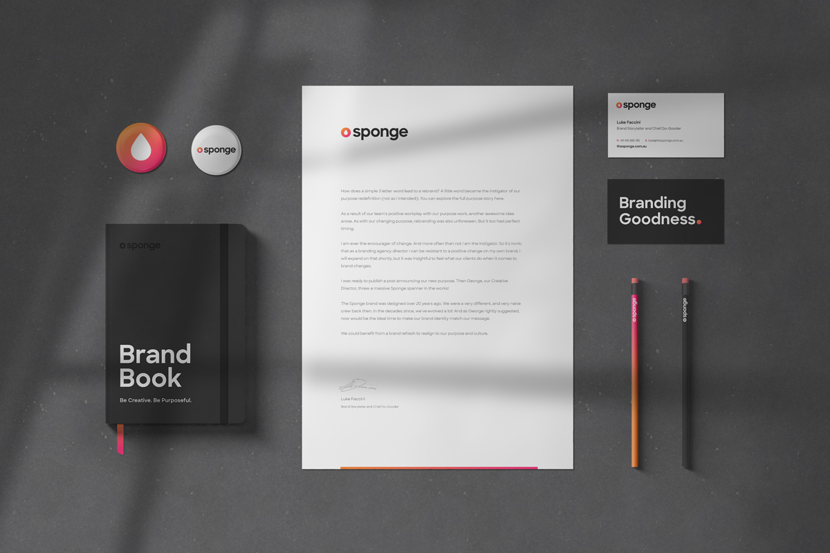
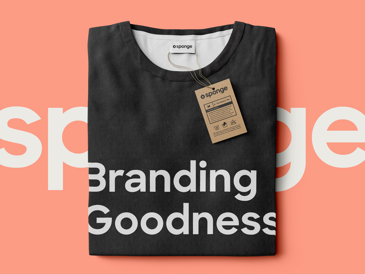
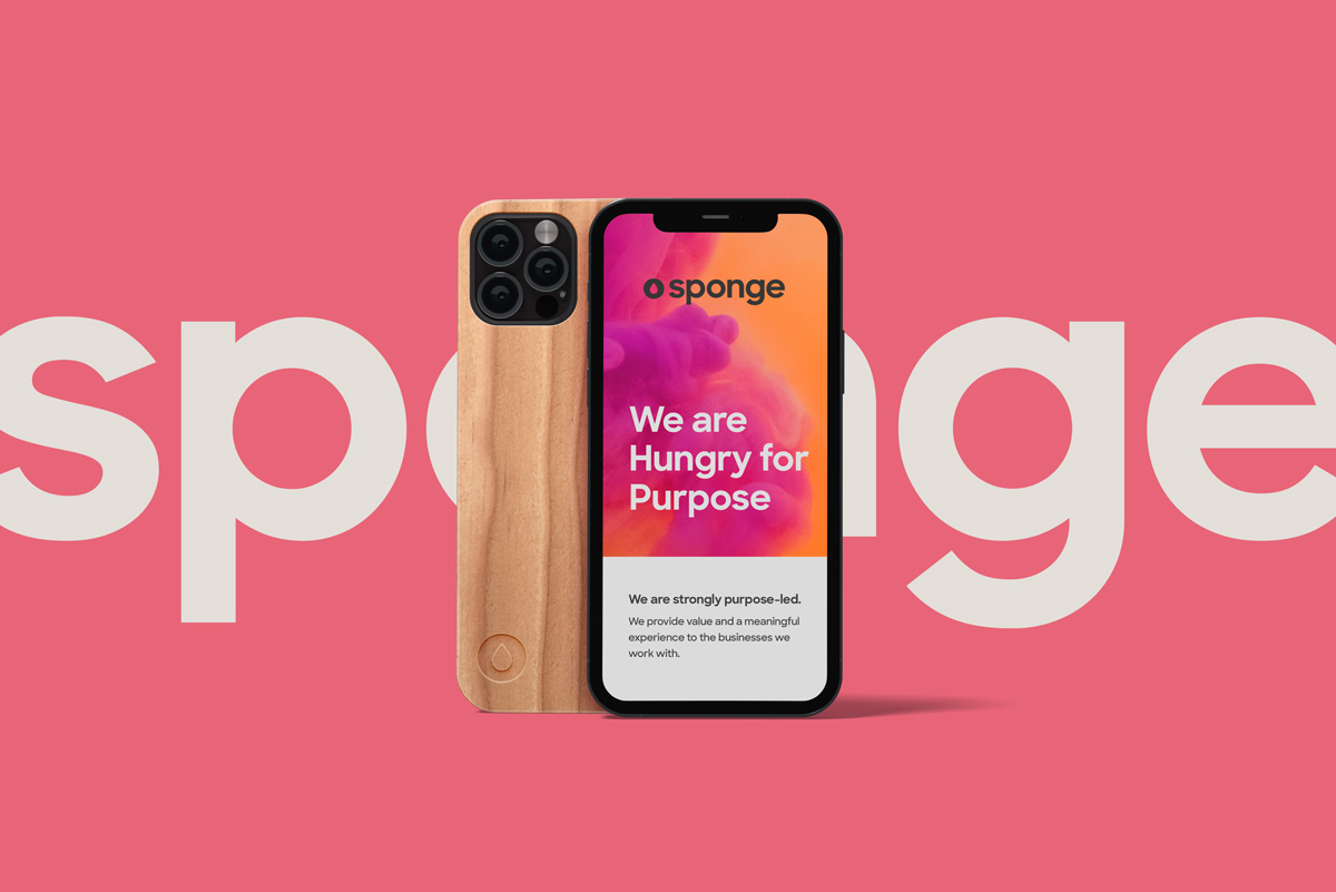
And there you have it. Our new brand mark is born.
Where to from here
At the time of posting we have updated our brand across our website and email signature, and we are working on the socials now. You can see the social here: LinkedIn, Instagram, Facebook . Feel free to follow us while you’re there.
The website will get a full makeover soon.
Behind the scenes a suite of presentations, templates and other materials are in various states of updating. The joys of roll out! 🙂
Being completely virtual we don’t have the task of changing signage and fitout to suit.
If you see our old brand anywhere, let us know and we will send you a spotter’s reward for helping out.
The upside of change
Our team loves the new look and feel of the brand. It embodies the heart and soul we put into the work we do, and is more human.
The brighter colour makes our brand more eye-catching than our neutral gray ever did.
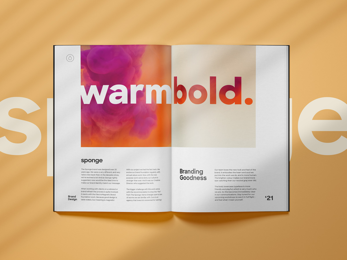
The bold, lowercase typeface is more friendly and playful, which is very much who we are. So this becomes immediately clear in our communications. Stay tuned for our upcoming workshops to see it in full flight – and feel what I mean yourself.
Your thoughts
We took the journey we often tell our clients to do! And now I’ve experienced the same resistance our clients do when we advise name change! Like when they do, I’m also glad I trusted the process and that we did the work, because I love the result.
What do you think of our new brand?

