The Byron to Bundy conscious business and B Local community needed a rename and rebrand to resolve the geographical challenges and confusion caused by the name.
What Did We Do?
Brand Name Creation
Strategy Execution
Brand Design
Rename, Brand Strategy, Brand Mark, Brand Collateral, Website, Seasonal Promotions, Pull Up Banners, Digital Advertising, T-Shirt Design
Rename
The Byron to Bundy organisation established its name without defining their brand purpose, values, or model! They didn’t talk to the market to get clear on who would be their community members (their customers)! And they didn’t get clear on their impact model, so did none of the foundation work before the name. They were way too eager. And destined for problems.
The main attributes we wanted the new name to embody were:
Increased scope within Australia (and potentially global)
A movement (in conscious business)
And momentum (be forward moving)
And of course, be short, memorable, sound good, be easy to say and spell.
It increases the scope to include community to the very tip of Australia. And addresses the current community with ease.
GoodNorth is true north. Good is the true north. Find your true north at GoodNorth. This whole idea changes the context to that of a global movement of Goodness (in business and life).
North is upwards and onwards, embodying positive momentum.
And it is short – two-syllables, so hard to screw up. It is easy to say and easy to spell.
Brand Design, Rebrand
Watch the video here for an overview of what we did for the Byron to Bundy to GoodNorth visual rebrand and how we integrated the key story points.
We brought design elements from the old brand into the new brand making it recognizable:
The typeface is similar
The word stack is also familiar
The colours are the same
In addition, we have captured some of the new story in the design:
A true north pointing compass point, because Good is the True North.
And we have fused the OOs together in GOOD to symbolize the strong community connections this organization is all about
With this new design, the existing website and social channels are a relatively seamless refresh. It has been designed to be quite flexible to translate easily across the different mediums
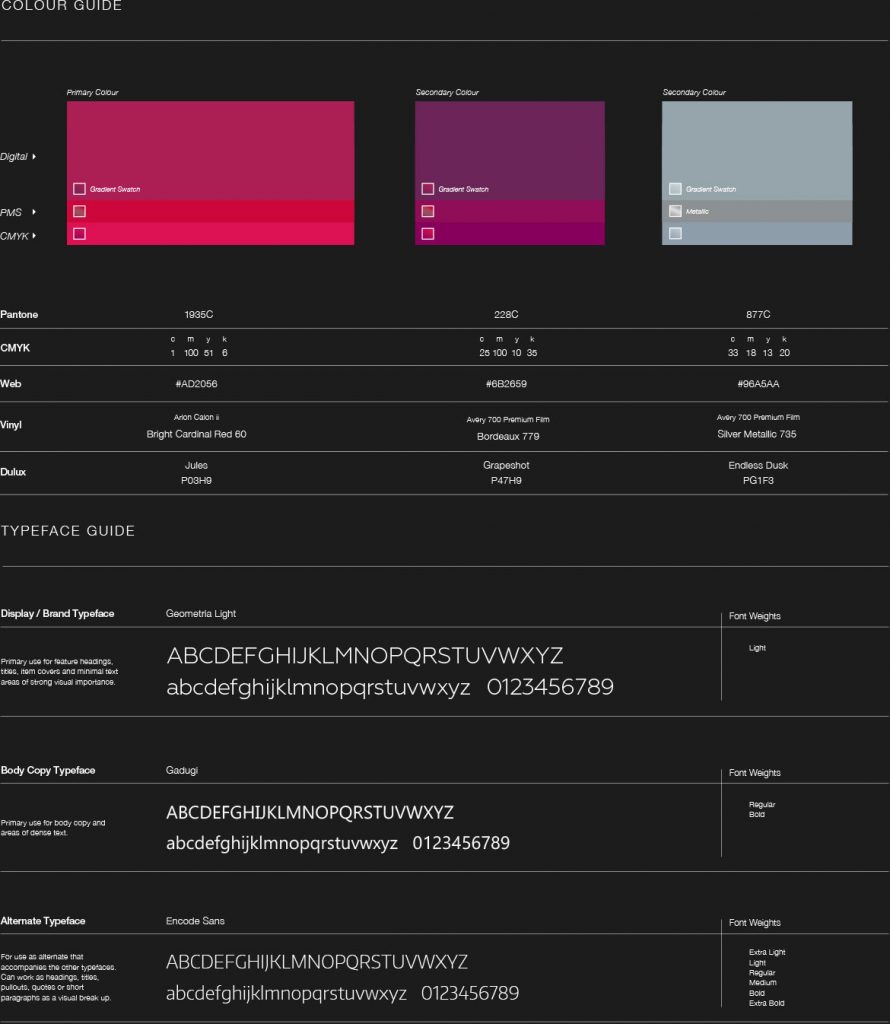
Style Guide
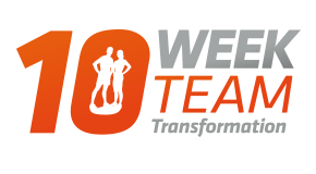
Below is the logo presented in primary colour and in reverse. Additionally, there is the brand colour guide where we leave nothing to chance, especially with Orange.
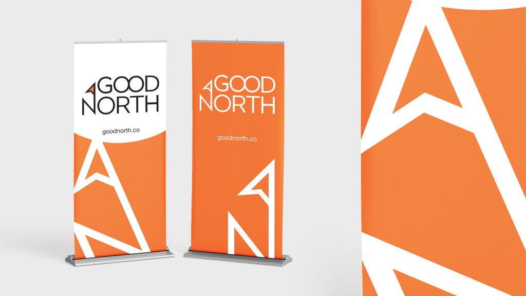
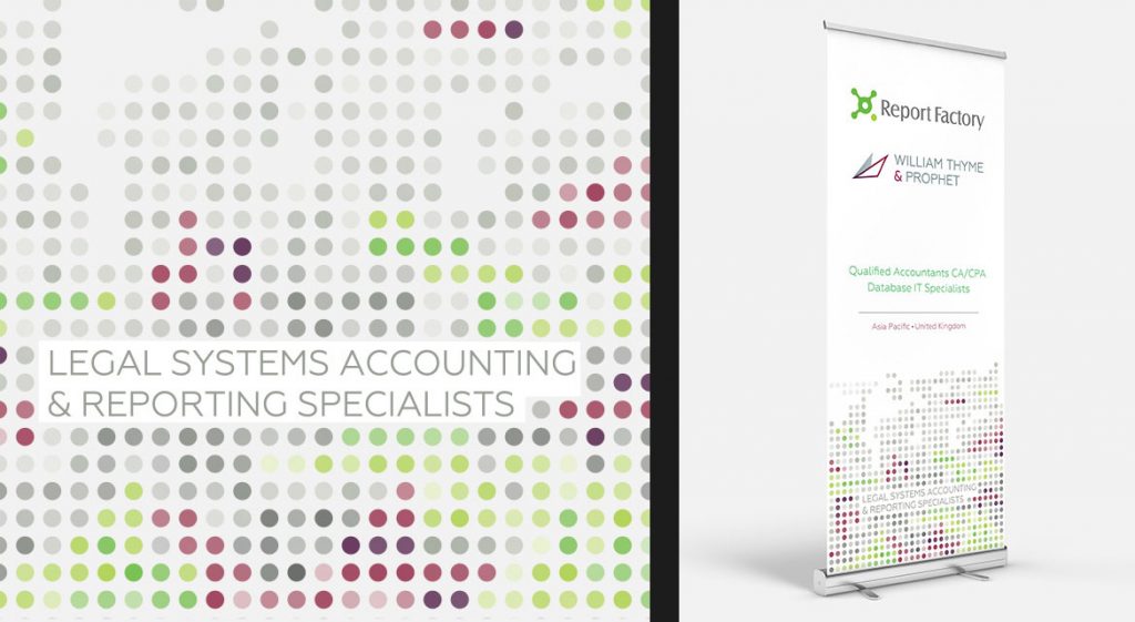
Pull Up Banners
Events are a focus for GoodNorth, so pull up banners are bold, simple and place the logo at eye level to make for great photos.
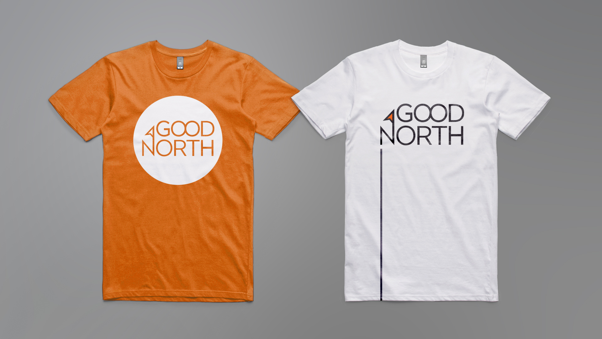
T-Shirts
The key to a great t! Bold colour, simple graphics, easily recognizable from across the room and in photos.
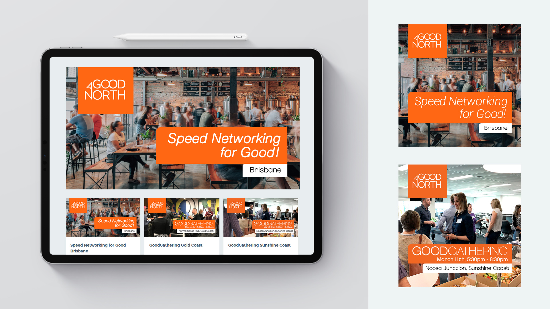
Social Ads
Social media and email communications are the means today to get people to attend, so a design suite to cover Instagram, Facebook, LinkedIn and ticketing sites was required.
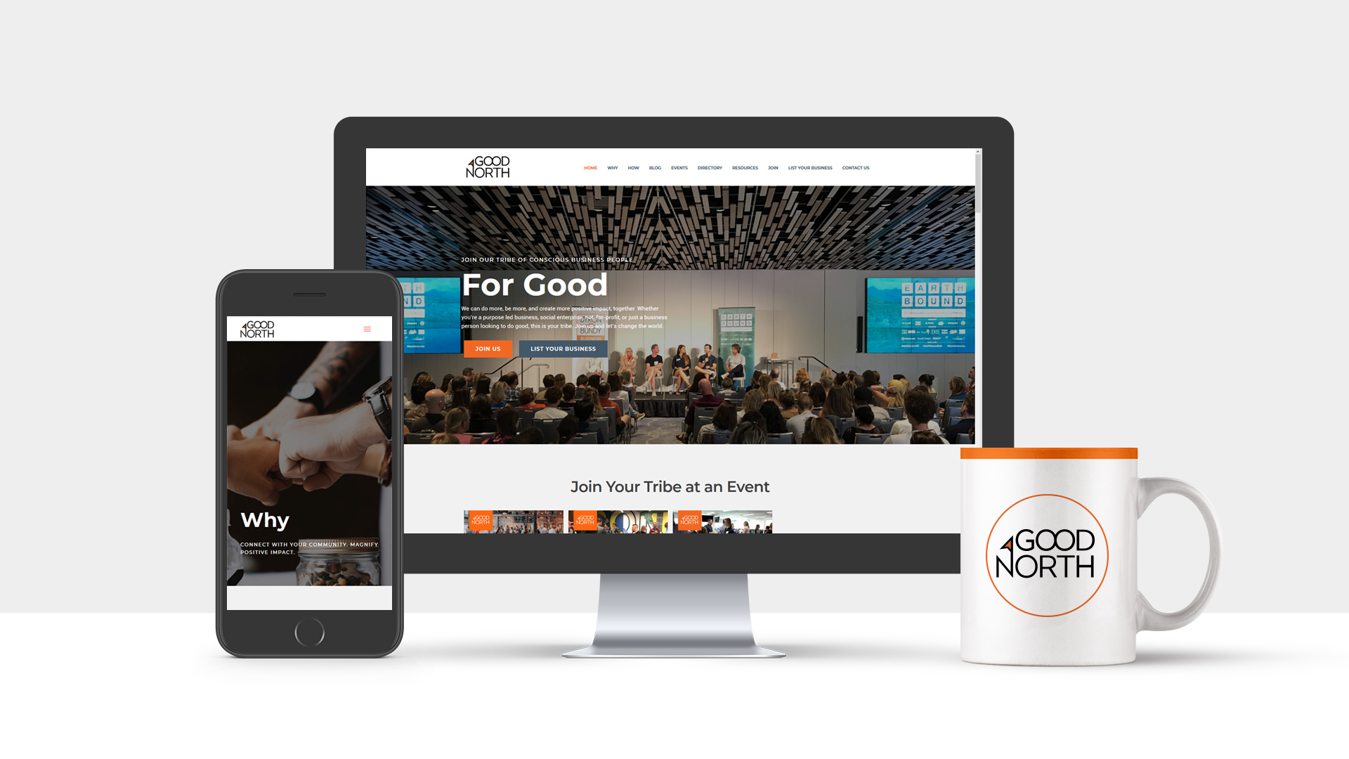
Website
The website had been designed and built by our team prior to the rebrand. With colours and typestyle being kept the same, it was a simple matter of cloning the existing site and migrating to a new domain name. Then the exchange of logos and brand name throughout the site. Naturally the website is desktop and mobile friendly.
Two entrepreneurial brothers were looking to fill a gap in the fitness industry and wanted a partner to develop a fitting brand name, mark, strategy and assist with their ongoing marketing
What Did We Do?
Brand Name Creation
Strategy Execution
Brand Strategy
Brand Design
Brand Name Creation, Brand Strategy, Brand Mark, Brand Collateral, Stationery, Business Cards, Brochures, Promotional Items, Product Labels, External Signage, Internal Signage, Posters, Decals, Digital Signage and Advertising Systems, Class Role Screens and System, Website, Custom Club Management and Membership Operating System, Club Management System, Printed Seasonal Promotions, Outdoor Banners, Digital Advertising, Mobile App
Brand Name Creation
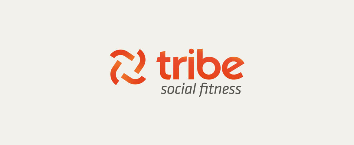
The name Tribe Social Fitness was created to bond and empower their clients. The inclusion of the Social Fitness positioning within the name drives the culture of the brand.
Tribe
Here’s why: A tribe is where a human belongs. There is unity, support and accountability. In a tribe one can thrive and get where they want to be.
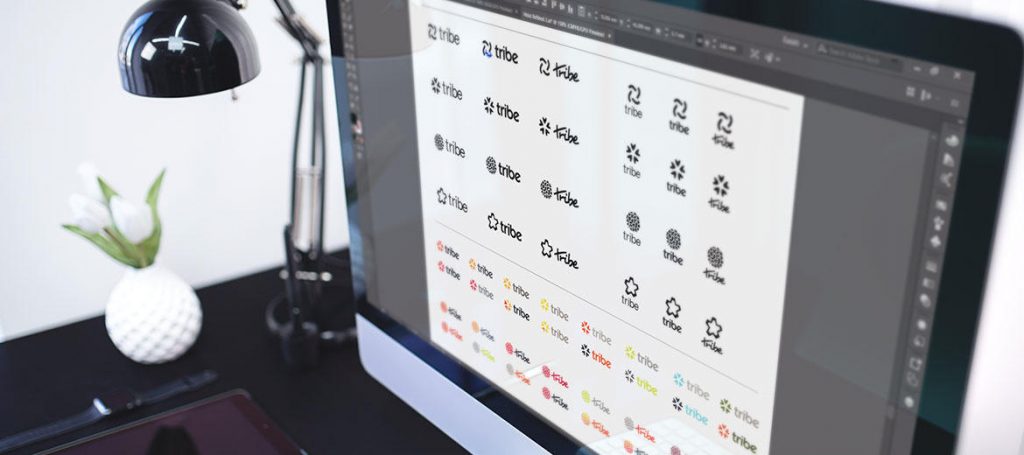
Brand Design
The icon design is an abstract of four arms locked in monkey grip, it is also symbolic of a tribe with momentum, turning in unison in tight formation. It is bold and strong.
The typography is open and friendly, approachable and fun. It is active and energetic. The orange colour says new, affordable, and energetic.
Style Guide
Below is the logo presented with the social fitness strapline lock up with a digital treatment, in primary colour and in reverse. Additionally you will see the brand colour guide where we leave nothing to chance, especially with Orange.
Sub-Branding
Over the time we were working with Tribe we developed a number of campaign and product brands. Here are some. You can see how they fit with the parent brand.
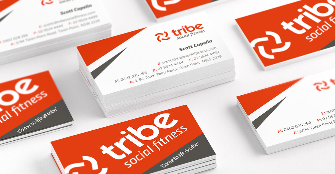
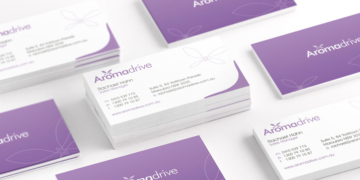
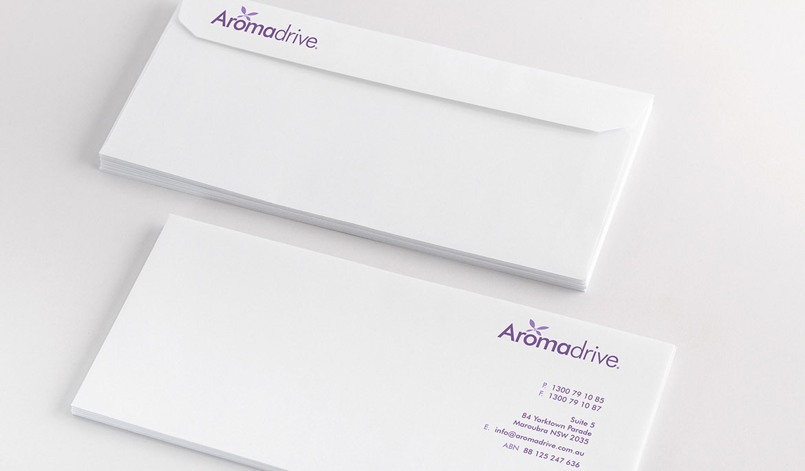
Stationery
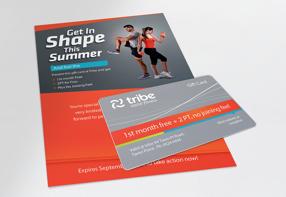
The tribe stationery suite consisted of business cards, letterhead, follower, presentation folder, and an assortment of envelopes and other printed mailing pieces including gift cards, vouchers and more.
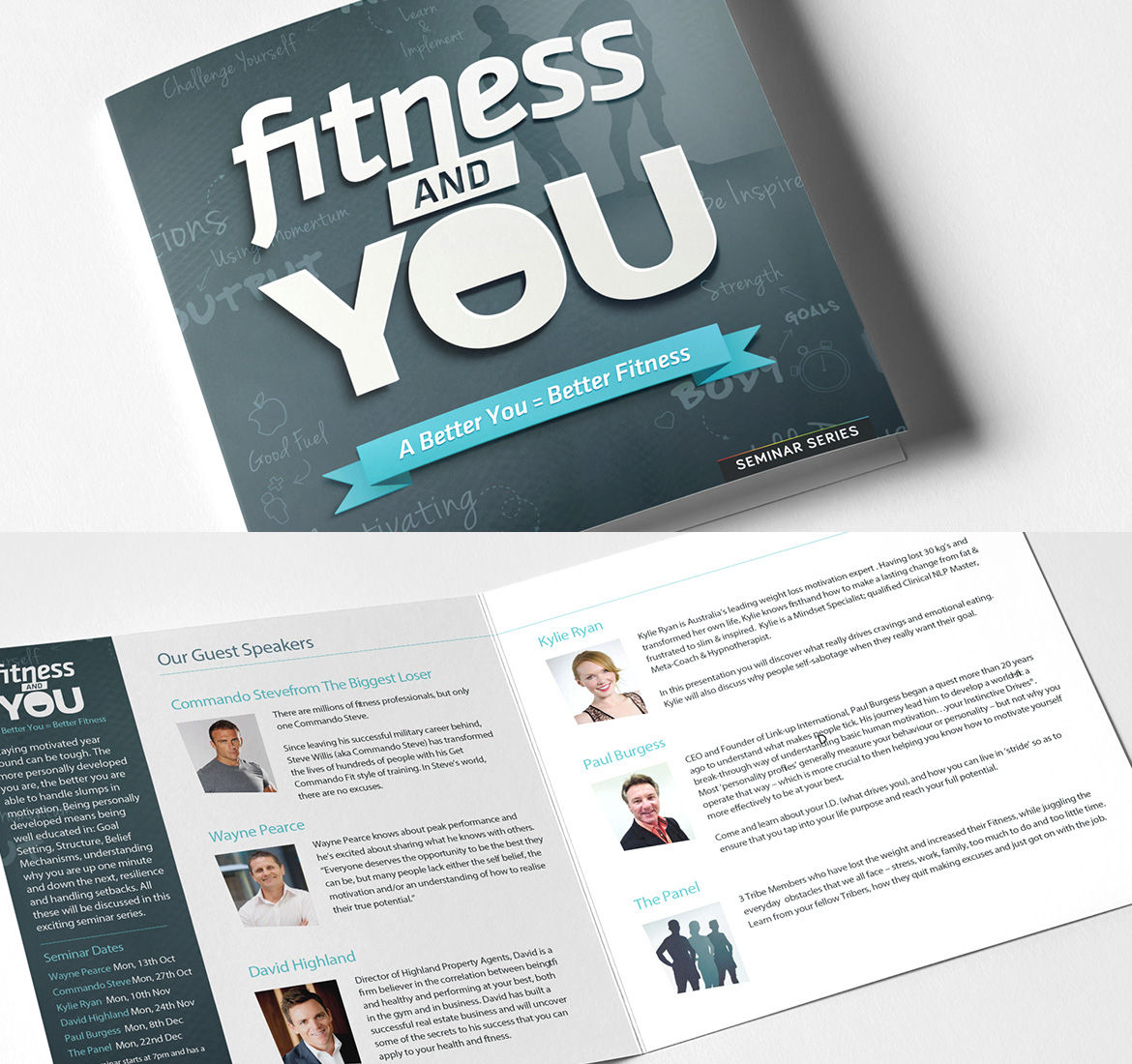
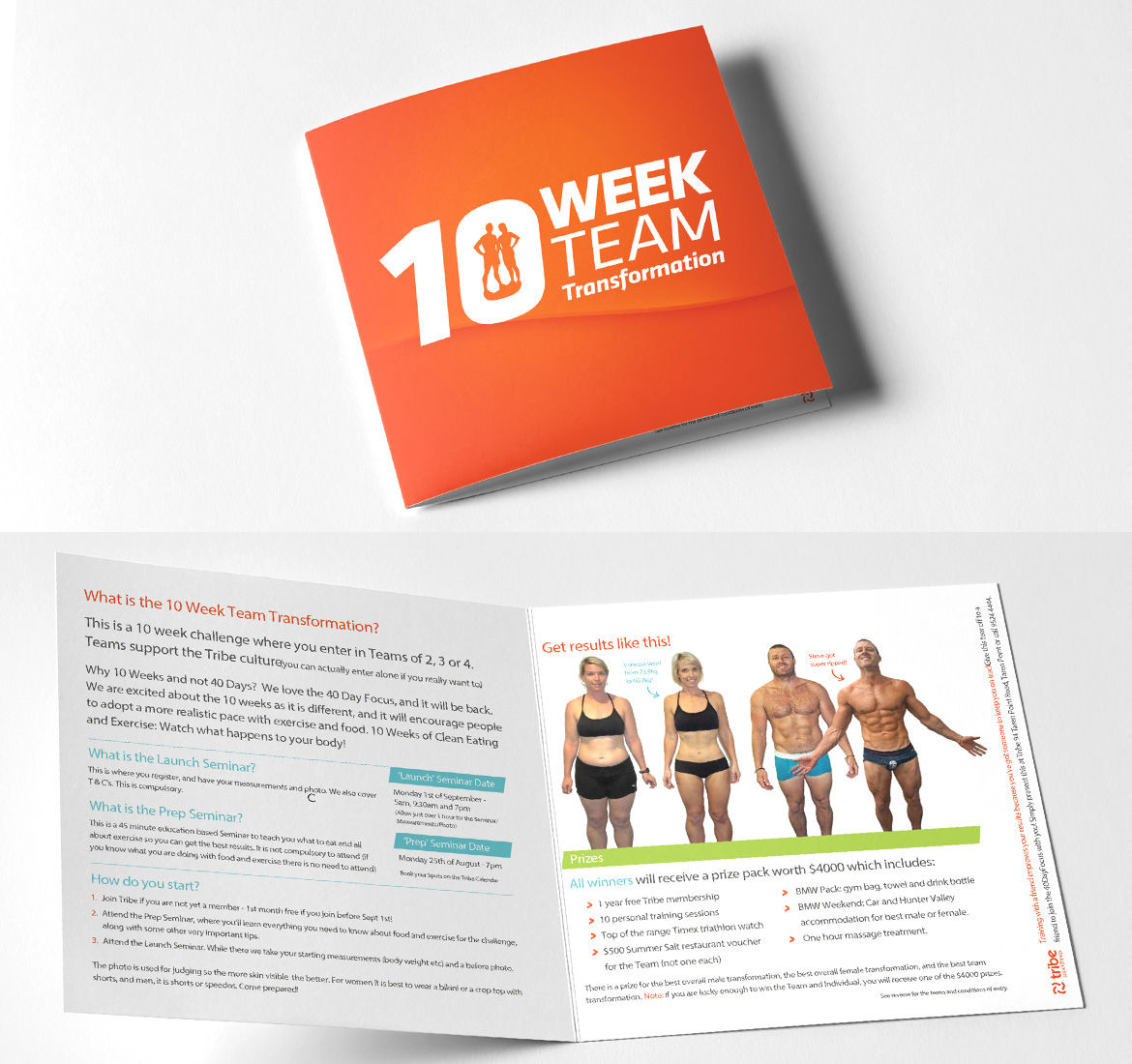
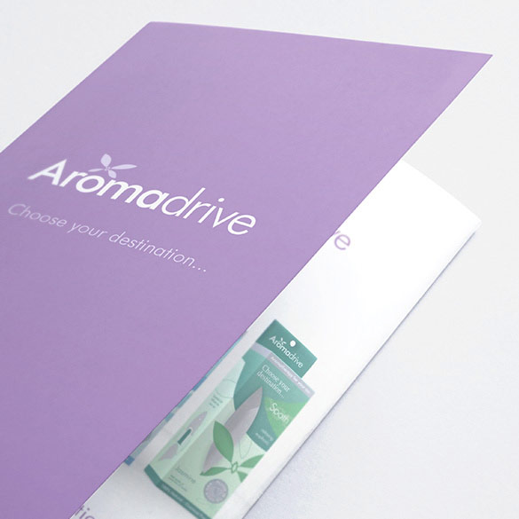
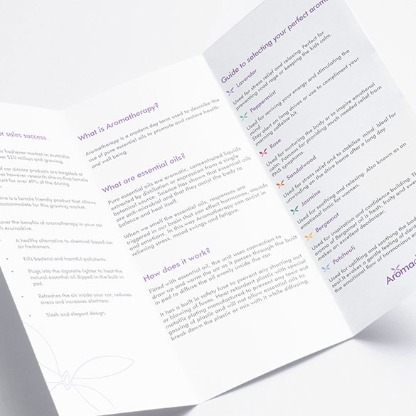
Brochures & Sales Material
The club required membership brochures, event brochures, and promotional print material. We helped them stand out with unusual sizes and high quality print and finish. We produced plastic gift cards, event tickets and more. It was a case of what is the best way to communicate with the members and market.
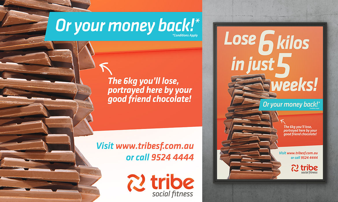
Posters
Internal and external promotions were a monthly event for the club. This involved creative direction, photography and art direction. The results were printed posters, digital banners, email campaigns, and external signage to communicate the promotions.
Product Branding
Designing product labels for Tribe’s protein and water were a fun project to work on. We worked up different colourways to communicate the flavours.
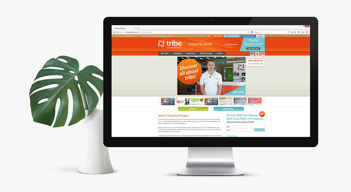
Website
The website we designed and built for tribe (not the current one) was video and photo rich, which we shot and edited. The content expertly copy written and produced. The site was built using PHP to integrate with the custom member management system we built for them.
The site was mobile friendly and responsive.
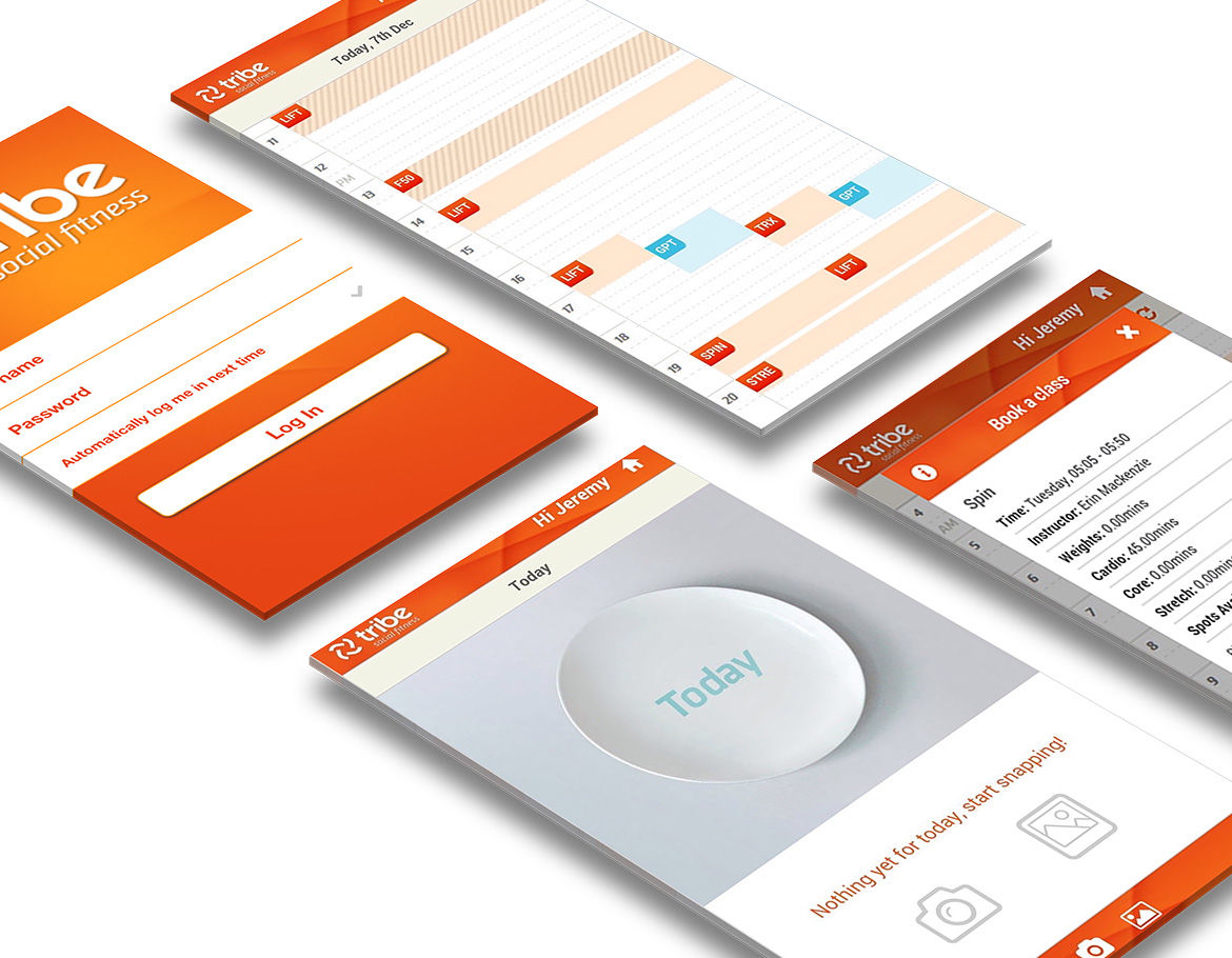
Member Website
We built the member site with the member’s usability in mind after surveying members and finding out how they wanted to interact with it. A members calendar allowed them to book classes, PT sessions and create their own private member events. There was a social feed that they could see their friends activities in the club, all designed to keep them accountable.
Members were able to review their membership account, log of their activities and much more. This infrastructure was evolved over years and cannot be summarized in 2 paragraphs.
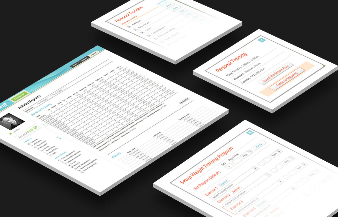
Admin & Staff Website
Similar to the member site staff were able to manage bookings in their calendar. This section had multiple privilege levels where the owners can do financial projections, client retention reports, staff management, POS sales at the front desk, class management, advertising management, membership billing and much more.
This system was built completely from the ground up, from conceptual discussions, feature development to building, testing and integrating into the live site. It was the first club management system to be completely credit card payment only with full automation for membership fee collection and dynamic membership fee processing.
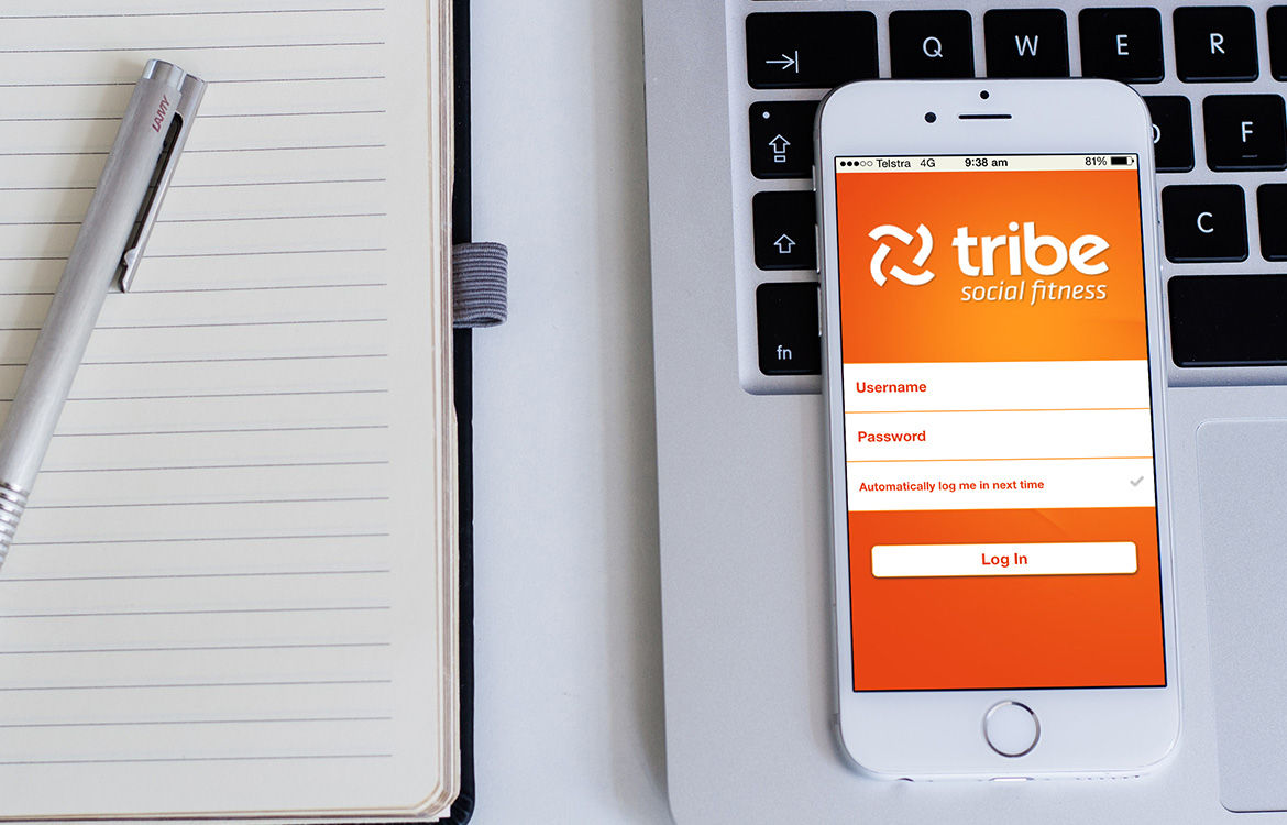
IPhone App
The perfect accompaniment to the members site was the iphone app. It allowed members to easily book classes and PT session, as well as receive reminders on their bookings.
We built in a visual food diary for them to use to document their nutrition for their personal trainers to review.
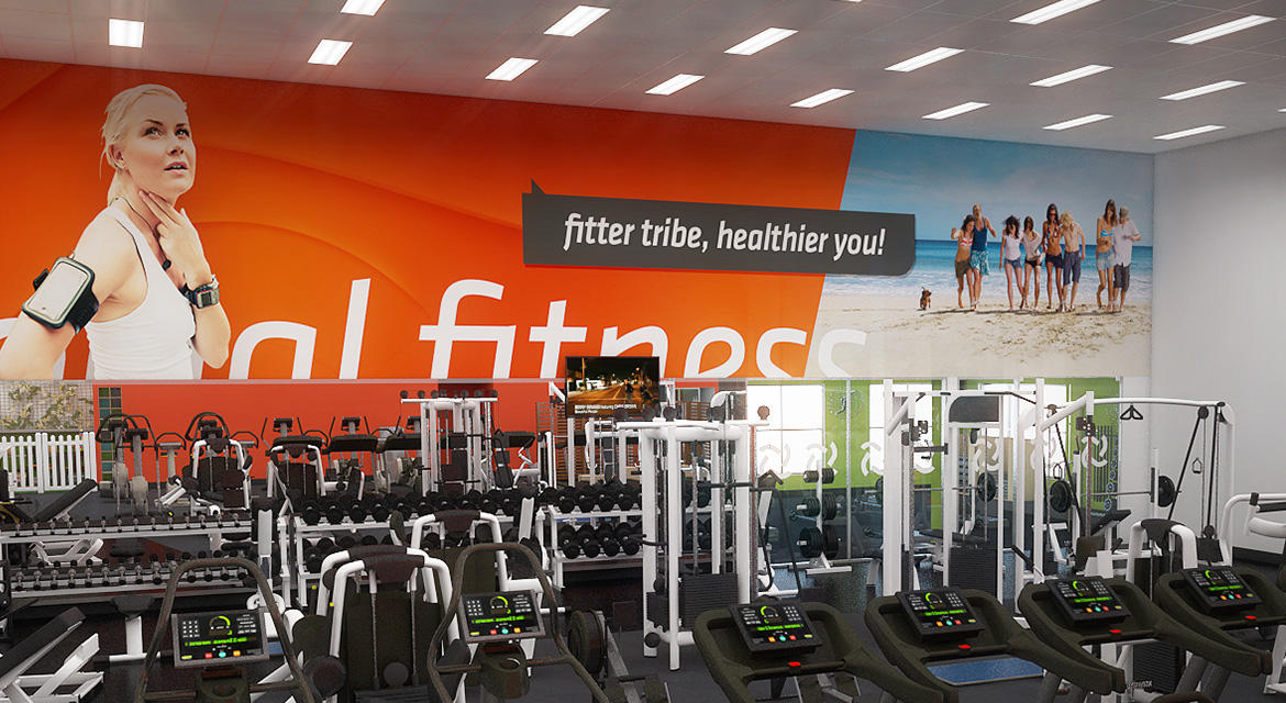
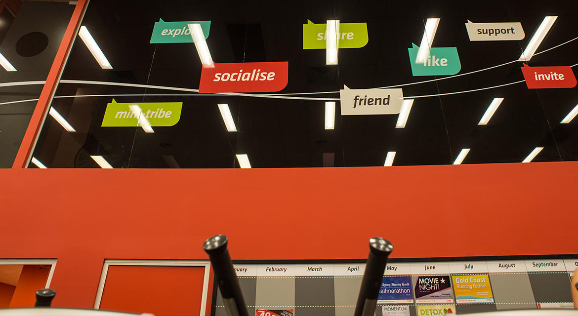
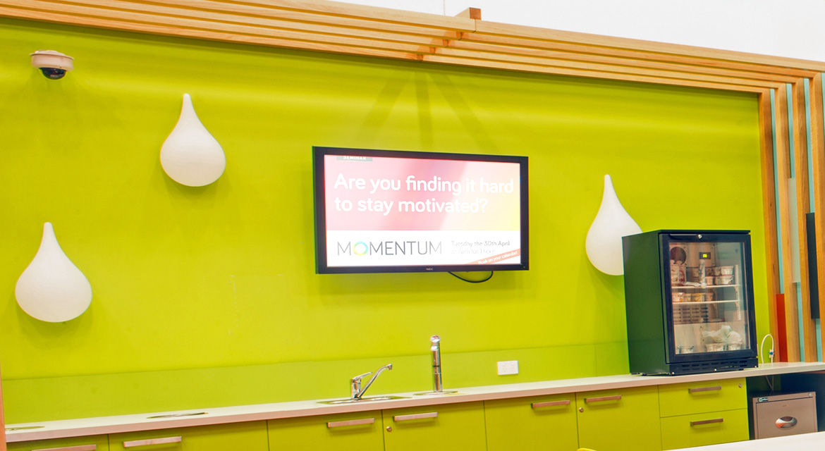
Internal Signage
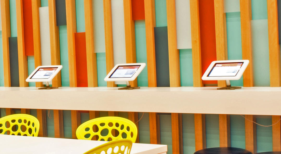
Brand culture is so important. One of the easiest ways to encourage great culture is make the brand come to life in the environment. As you can see here we worked with the interior designers and architects to ensure the brand did that, from colours, to decals, digital signage, and the details in the member ipads.
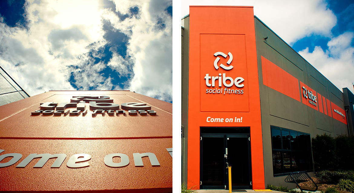
External Signage
This building is iconic to locals because of the signage and colour that we directed. It cannot be missed and it communicates the brand message perfectly. We also leverage the high exposure location to promote seasonal offers with banners that span the external columns.
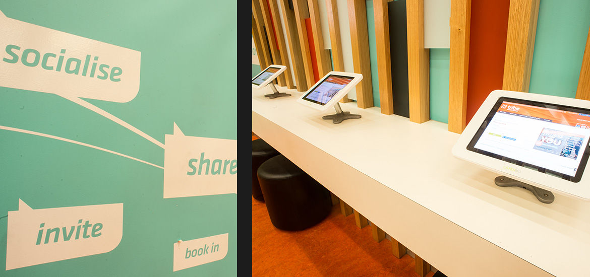
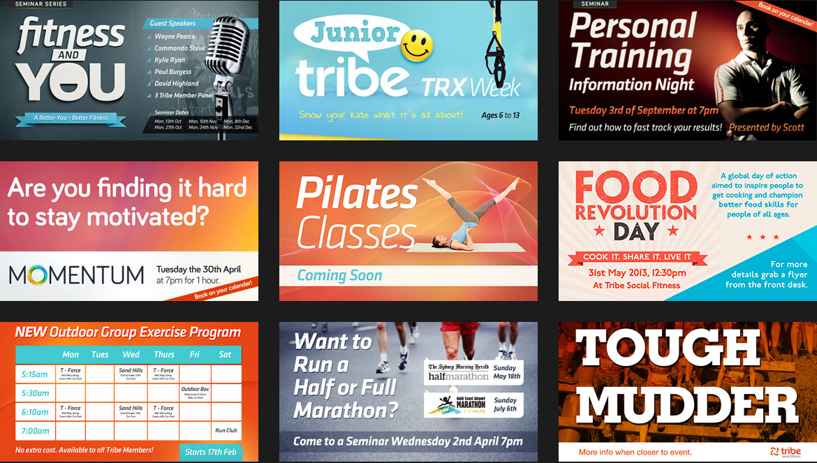
Internal Digital Signage And Monitors
We designed and programmed an internal signage and advertising system to rotate between class roll call screens (that dynamically updated when spots were booked and when people swiped their fob to enter the gym), and current advertisements managed through the staff website. This system made all members accountable and aware of what is happening at the club.
You can see some of the designs we did below.
IPad Kiosk App
It was important to facilitate the members booking spots in classes at the club. To do this we designed an internal iPad centred system. It ensured members were logged out after a short time and created other special internal functions only accessible in the club.
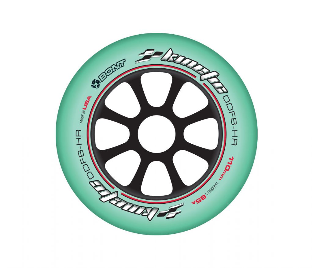
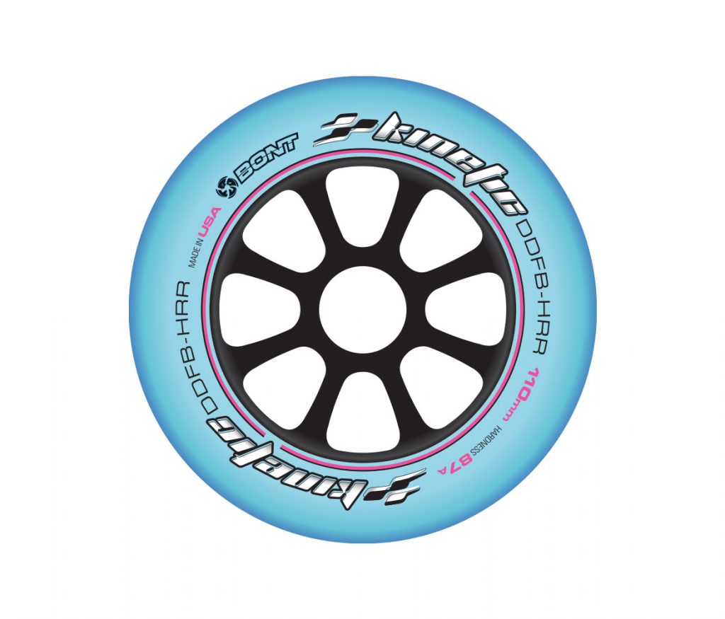
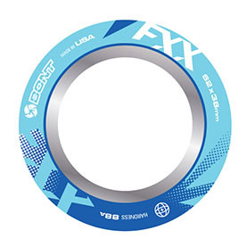
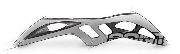
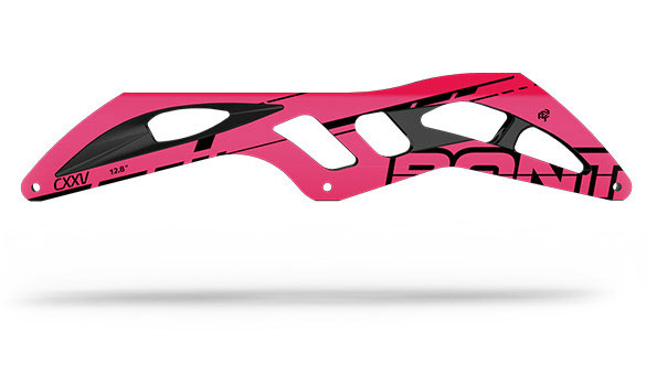
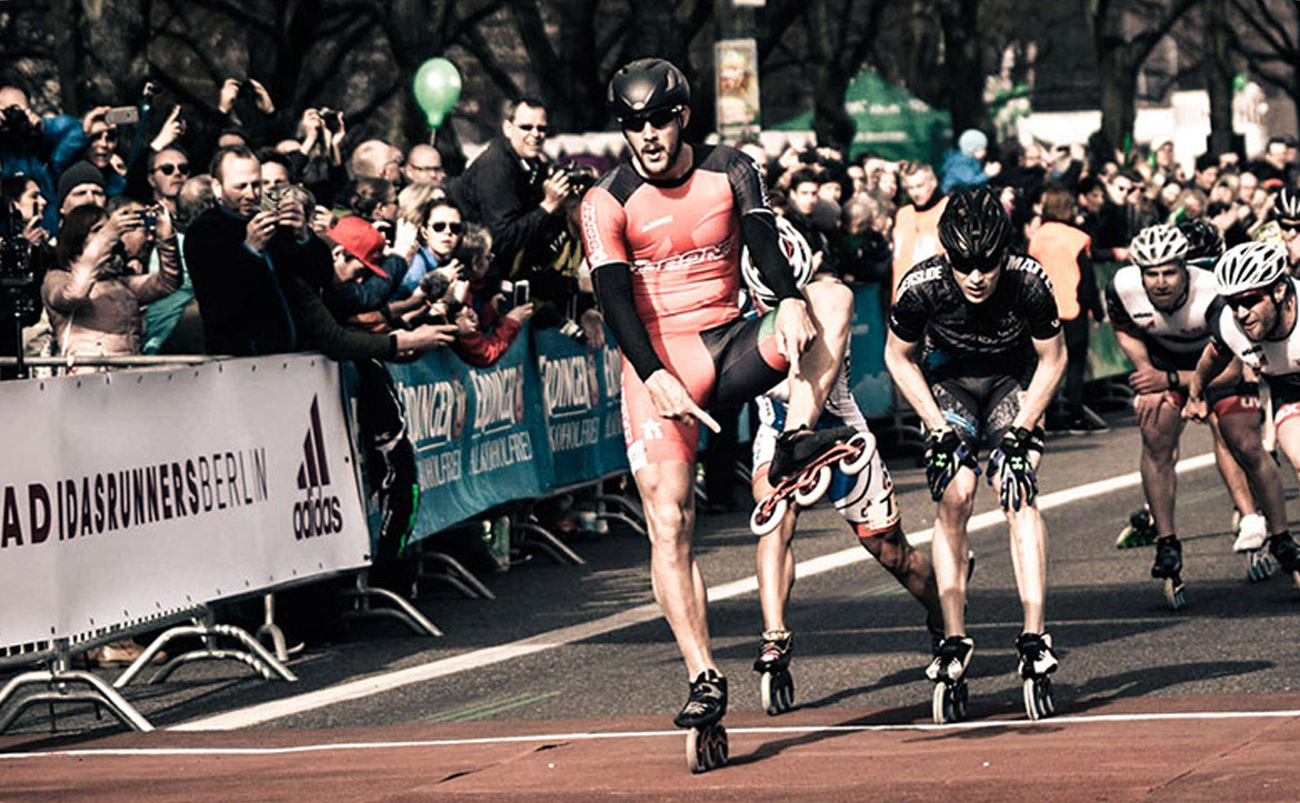
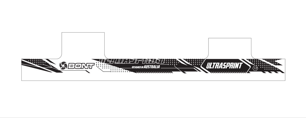
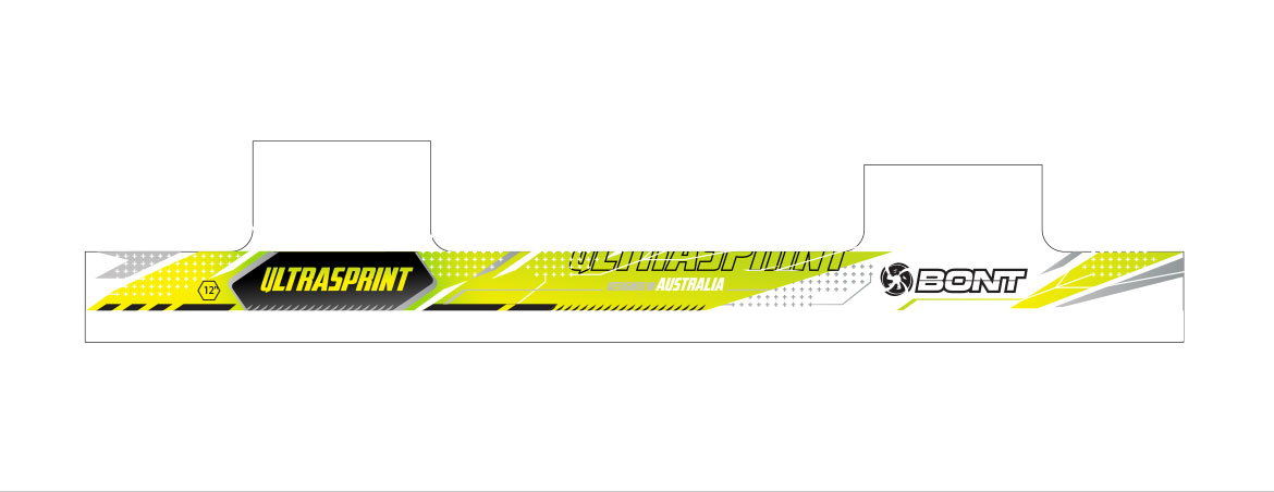
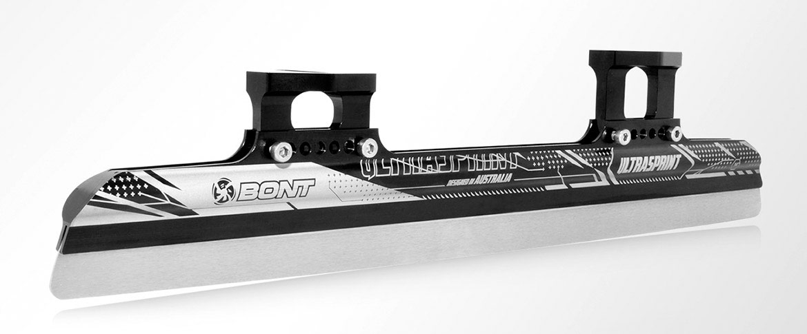
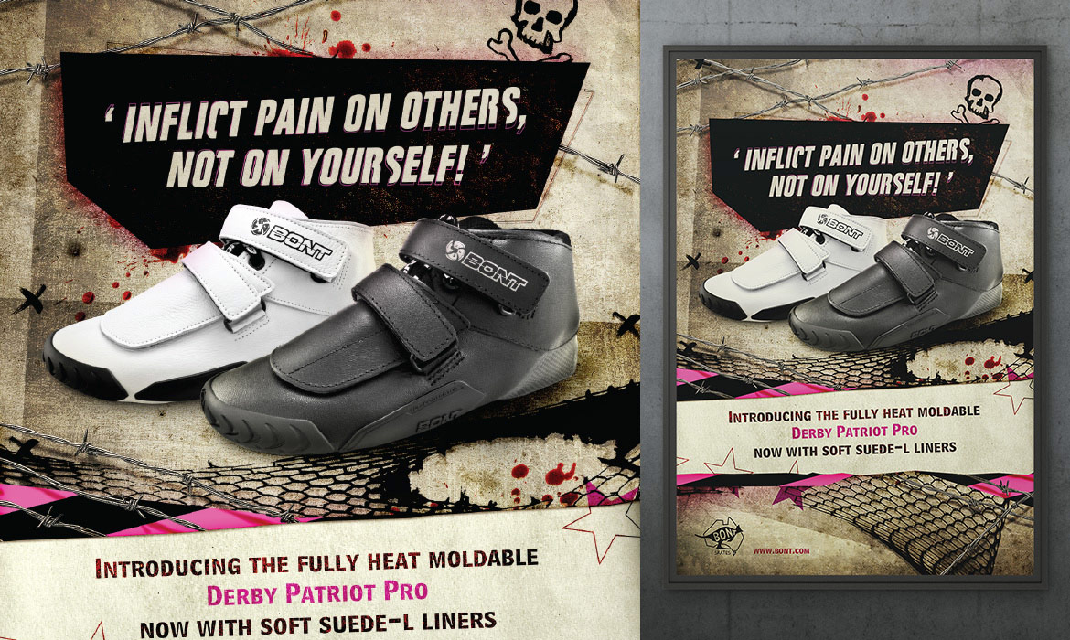
Fast wheels need dynamic graphics and fast looking product brand marks. We assisted with scale able designs and flexible color ways. We designed a multi page brochure and product poster to continue this design style through their marketing.
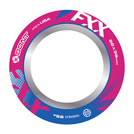
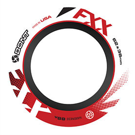
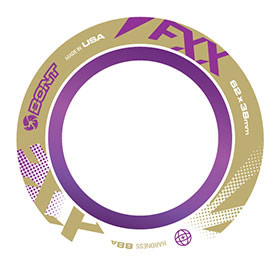
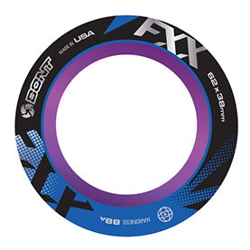
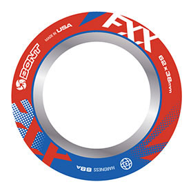
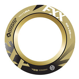
Frames
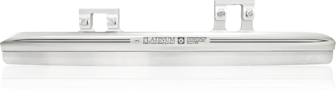
Blades
Ice. Cold. Speed! High tech blades, and premium materials, both require awe inspiring decals.
Web Banners
The digital sphere opens many opportunities to create branded advertisements. This is the case with for the Bont cycle boot.
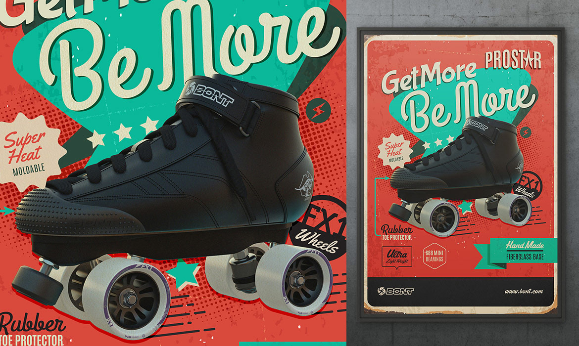
Posters & Print Adverts
Roller derby is a retro sport. What better way to speak to the market than with retro inspired poster designs. These designs were also used in magazine adverts.
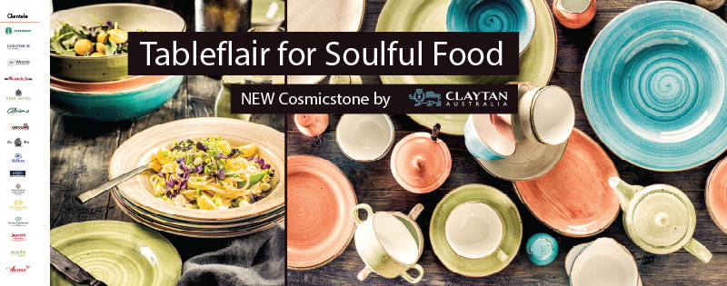
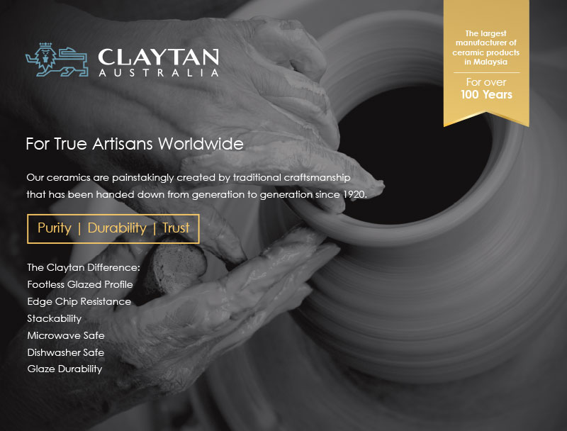
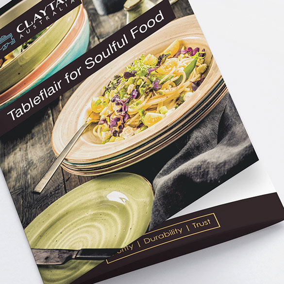
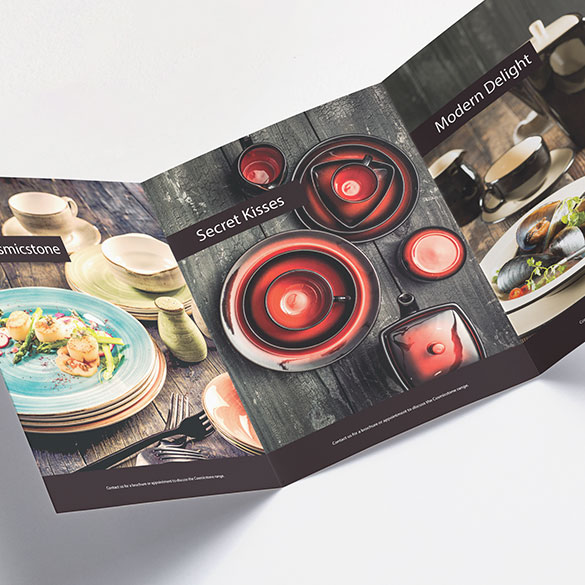
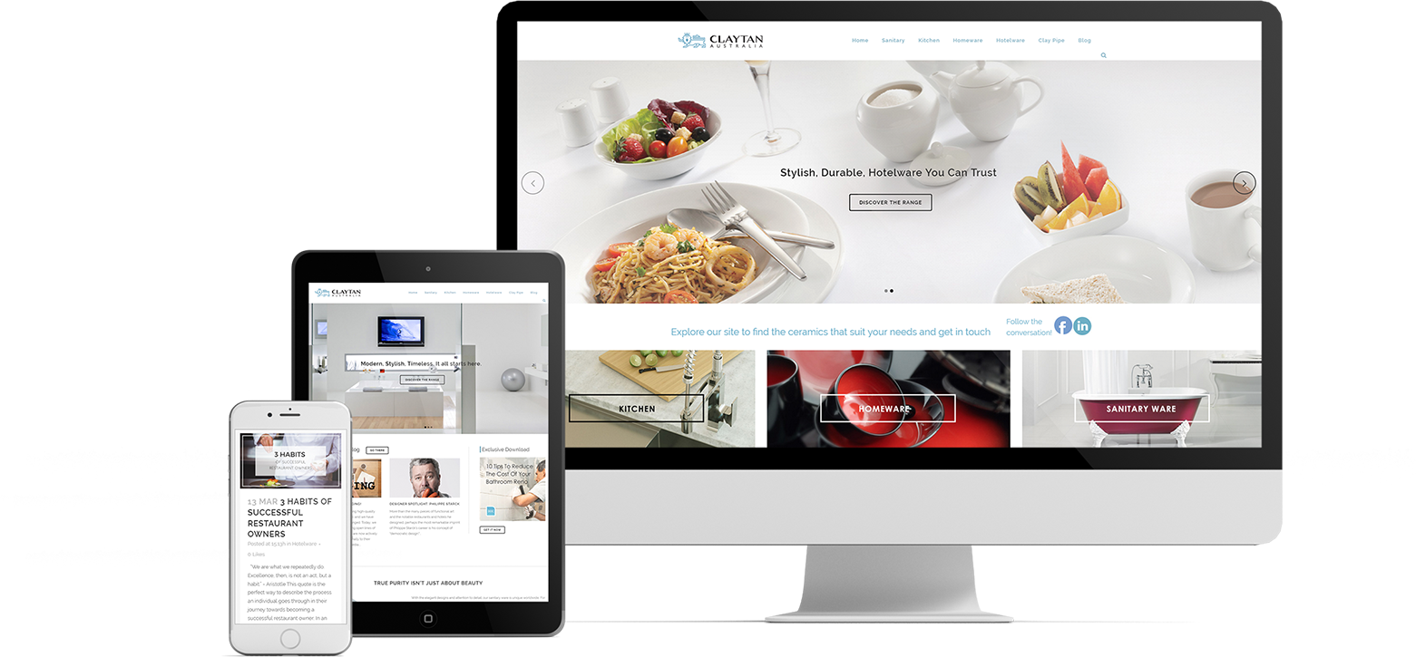
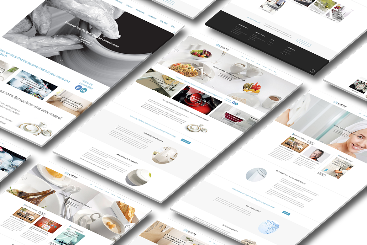
For over a century Claytan has been manufacturing ceramic ware, and supplying it to connoisseurs around the world. We help them tell their amazing story.
What Did We Do?
Brand Strategy
Brand Refresh
Strategy Execution
Marketing Strategy
For years we have worked with the Claytan Group to tell their story. It has involved the design of business cards, stationery, brochures, website and blog, social media profiles, event displays and promotions and overarching global brand strategy.
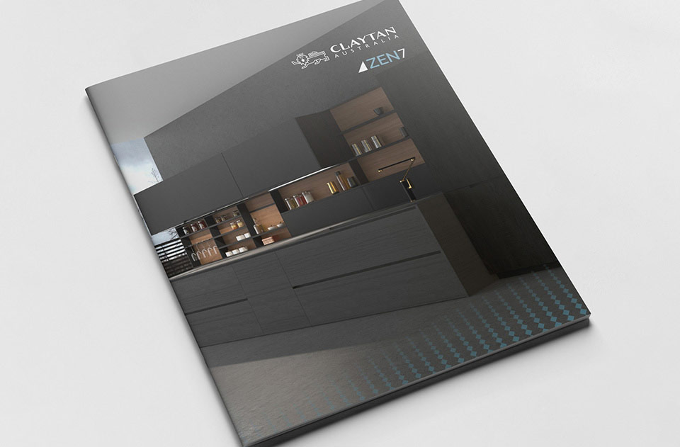
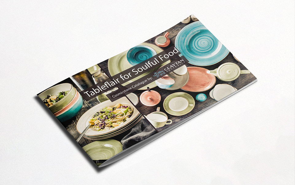
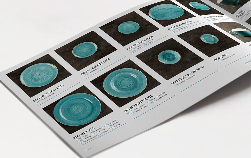
Brochures
In partnership with inhouse marketing we create concepts, design, produce copy, direct photography and produce exquisite printed and digital brochures.